Quick Tool Overview
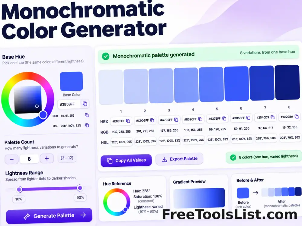
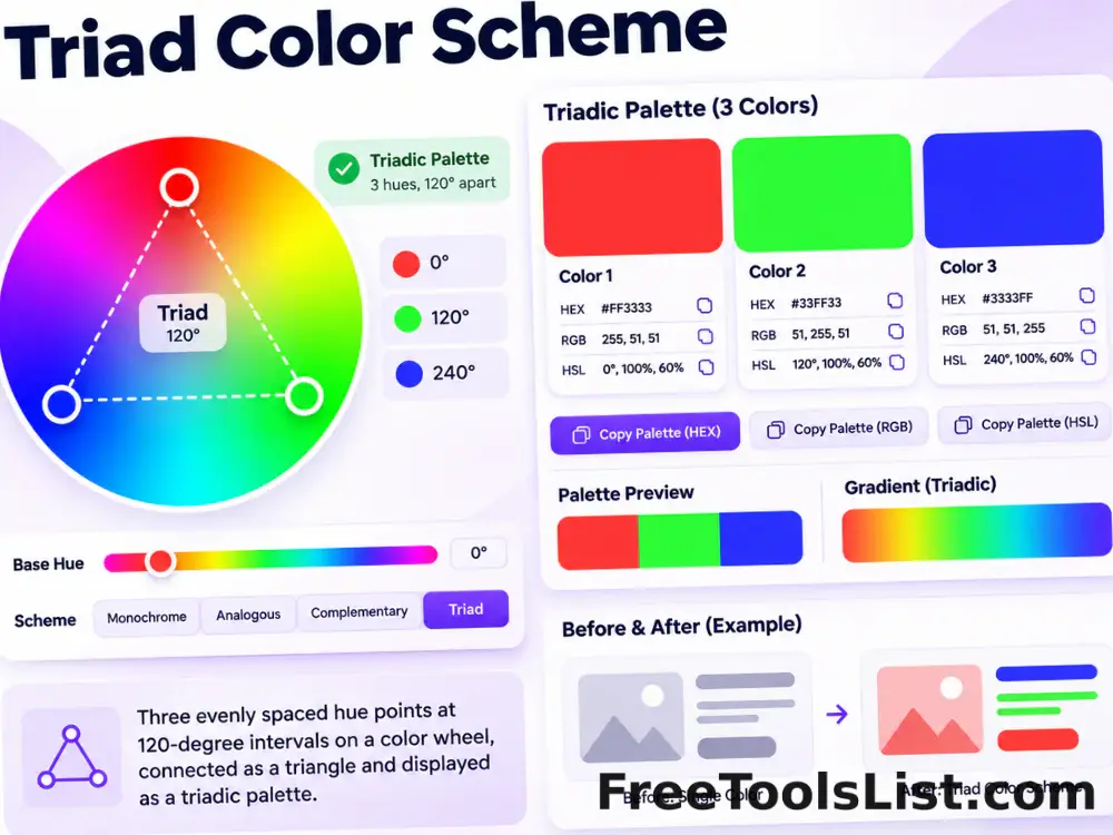
Make color decisions with visible values and repeatable controls.
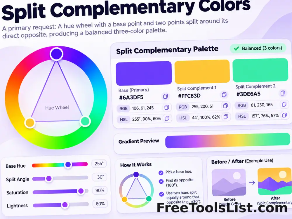
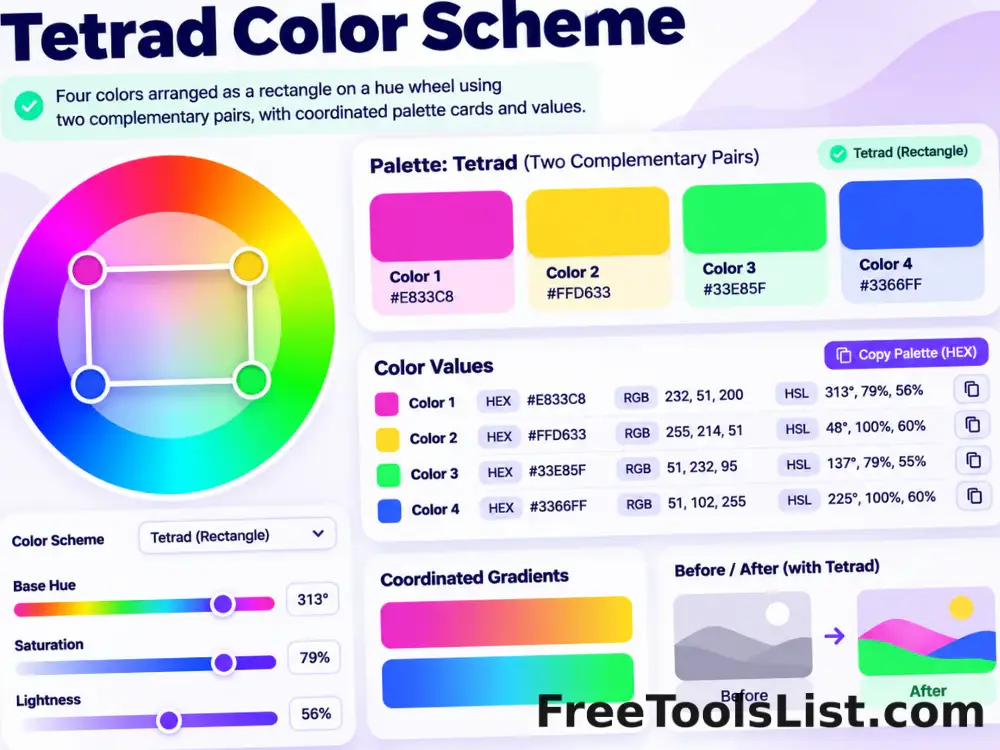
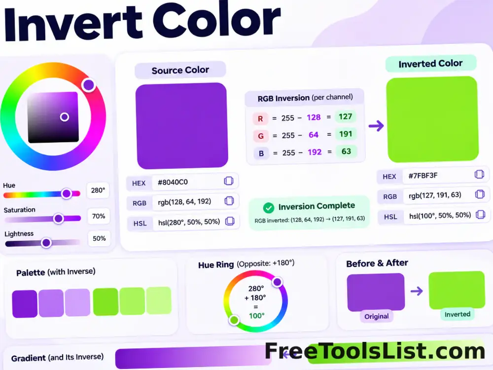
Complementary colors sit directly opposite each other and create strong hue contrast. It is useful for call-to-action accents, comparisons, charts and high-energy contrast.
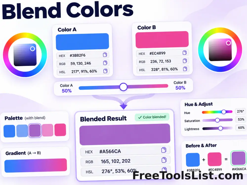
The companion hue is rotated exactly 180° from the base. Numeric color relationships provide a consistent starting point, but final choices should still be reviewed in the actual interface, image or print context.
◑Focused workflow
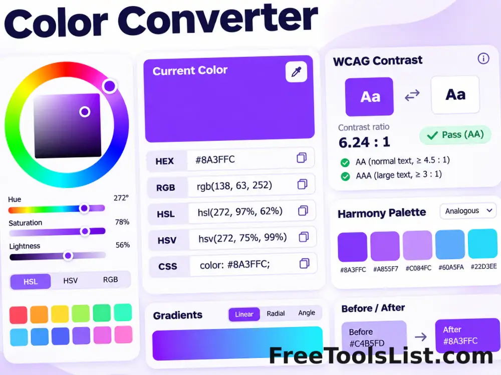
HEXCopyable output
RGBChannel values
HSLWheel context